Check Out My New Look For The Site And Programs
Recent changes I made to make my site comfy and mobile friendly.
 After a serious bout of procrastination, I updated the look of my ZX81 site to match that of my main site. In doing so, I’ve corrected the various errors that cropped up from my hosting upgrade. Clean and comfy, time to enjoy the new features this theme offers.
More polish, less fluff.
Part of the reason for the change was to bring my sites closer together code wise. Although not quite there yet, they are closer with the article and topics code now using the same slugs. Part of the problem is the two sites have some unique elements—on purpose of course. So, I need to ensure those pages work.
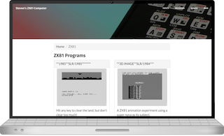
Specific to my ZX81 site, there are number of program pages that are unique that were in need of an update. Besides adding shortened slugs, I also revamped and tweaked the pages to match the new style. The result of which is mobile ready pages that look good at any size.
Cards of programs a plenty.
Looking for a bigger change, I got rid of the boring program list and created a menu of cards instead. The cool part is that it allowed me to bring the articles and pictures I’ve added over the year to the view.
Looking like a Pinterest board, two columns of programs will greet you. The pictures will help you see what each program is before you list or run them. I added a link to an article, if there is one, so you can also read about the program right from the cards.
For the programmers out there, I used Masonry to create the layout along with Bootstrap. Stumped by an overlapping cards issue, I dug back through Masonry’s site. I discovered it was an issue with unloaded images messing up the layout. The solution was to use imagesLoaded to force the layout to update.
Responsive fixes make my site mobile friendly.
Besides creating a new card listing, I also made sure to reduce it to a single column when viewed on mobile. Each image will fill the screen width as well, ensuring it doesn’t overlap the view. Together, it brings my ZX81 programs into the modern mobile era. But wait, that’s not all.
The program listing, which used fixed fonts in the past, is now responsive as well. I scale the fonts when the viewport is smaller to ensure it looks great on every device. All those ZX81 graphics now look great on smaller screens, and pop with the new white background.
Oh, and if you run the program I made sure it works as well. After trial and error, I figured out how to make the canvas responsive. This works quite well for the animation programs, but you might find the games difficult. That said, I did turn on the keyboard as a background if you want to give it a try. The keyboard will scale with the canvas, so it should work okay.
Peace out to 2016.
And with that, it is time I say adiós to the past year. It’s been fun, with new programs and site designs. Now, what can I come up with for 2017?